Saturday 9 July 2016

Felted Monet Shawl

 Last spring Lyn Pfleuger led us through another great felting experience, creating a Monet shawl using dyed wool and silk fibre as well as incorporating pieces of wool and silk fabric. Such fun playing with colour in a painterly fashion. This is a picture of the wool and fabric before the felting process - you have to work big because the final product becomes about 2/3 the size.


You can see some of the detail in this picture. I chose to add stitching to define some of the shapes.

Coincidentally I took a trip shortly after the workshop and had planned to see Monet's gardens at Giverny, so had to take the shawl with me. It turned out to be a very practical addition to my limited travel wardrobe, keeping me warm on cold wet days, as well as dressing up for dinner.


Unfortunately we were unable to get to Giverny because of labour disputes, but it served me well against the cold winds of Skara Brae and London.


Monday 4 July 2016

Wooldling: Needle-felt Doodling

I've discovered a new needle-felt addiction totally by happy accident! I was organizing to teach a short needle-felt course for the Sheep Creek Weavers, a wonderful local fibre guild that I belong to. I was trying to source inexpensive supplies and some very kind ladies offered up their stashes of odds and ends of rovings. I ended up with an amazing mix of little bits of different kinds of fibre in a broad spectrum of interesting colours. Most of the pieces were too small to work as I normally do, so I started to play around to see what I could come up with. It became a bit of a colour theory exercise. I picked four or five colours that looked like they would work together, came up with a basic body shape using one or more of the bits and then just embellished from there. WHAT FUN! And very liberating. Each little monster is only a few inches high and doesn't take too long to make, so there are no worries about getting them right. I started to experiment with strange colour combinations, mostly with success. This is definitely an exercise in "more is more." Adding little tiny details makes the difference.


The population is growing rapidly. I've ended up with everything from quirky little birds, to three legged martians, to a very weird bull-seal-snail hybrid. I highly recommend trying it out. It also is a great way to experiment with tiny armatures. You can take it a step farther and wet felt them to give a smoother tighter feel if they are fairly tightly needle felted (seen in the last picture - work gently to begin with to secure the embellishments and remember to use non-rusting armatures).

 This approach spun off to the series of funky birds in my last post.

Sunday 27 March 2016

Calyx Sale Coming Up - New Stuff

We are all really excited to be back with the Calyx Sale - I'll be there with my art on Sunday.

I have some new types of art going into the sale in addition to some new Bragg CreekturesTrolls, framed slate, and two dimensional felt, etc.


Some quirky sea creatures, functional felt, and matted water colours will also be there. Should be a great sale - hope to see you there!


Wednesday 9 March 2016

Back to School Update: Drawing 211 - Media and Techniques

Drawing 211 was a really interesting course with a very experienced instructor. Unlike most of my other courses that had a small number of bigger assignments, this course had a piece due every week - so beware - lots of pics and a long blog. Each class started with a critique of the previous week's work and then on to the next assignment. I learned a lot from listening to the critiques and experiences of other students and I particularly found it helpful to listen to the instructor's opinions on each work in terms of what was working or not working. He also did demonstrations on air brushing, photoshop, and photo transfer as well as giving me invaluable tips on canvas preparation.

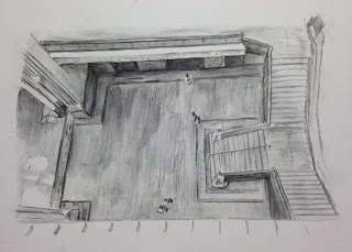
The first project was to be about a room we remember and why it is important to us. We were to make two drawings. A few years ago I had the opportunity to go back to the Museum of Natural History in Ottawa. I have many fond memories of visiting there as a child with my family and one of my earliest memories is looking down a very long way over a gallery railing and experiencing the thrill and terror of vertigo (and the panic of my poor Dad who caught me doing this). This was a very tough perspective to draw but I gave it a go. The second piece was a doodling version of what I remember seeing there as I wondered the galleries as a child. I came to realize how big an influence this experience was on shaping who I was as I took my more recent look over the railing decades later.


The original intent was that the fabric would overlay the drawing, but it was too opaque.


The second assignment was about landscape (yay!) with emphasis on why it is important and inviting the viewer in. This is a combined view of the pond behind our home and the mountains to the west. It's hard to see but there is an exit sign in the foreground. This is the place that I go to when I want to exit the craziness of civilization.


For the third assignment, we were instructed to listen to a number of Ted talks and create a piece inspired by one or more of them. I was amazed by many of them, but particularly by 
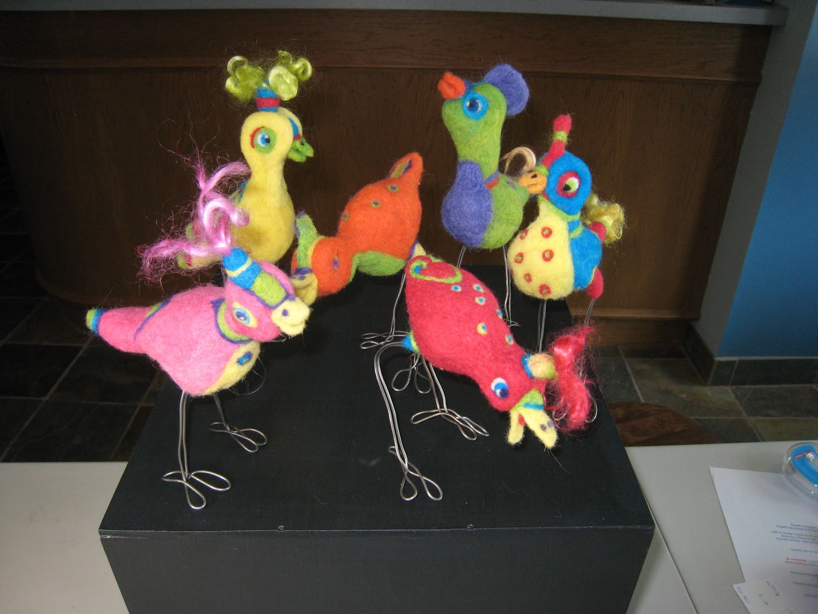
Evelyn Glennie's talk and musical performance about how to listen. I highly recommend listening to it - she is deaf and brings new meaning to appreciating a sensory experience even with an impairment. I've had a few visual scares over my life and a recent one was particularly frightening, not surprisingly because of how important the visual arts are for me. Listening to her lifted a weight off my shoulders and I decided to create "Feel." It was about creating a visual piece in felt that focuses on the sense of touch and incorporates braille. Using "felt" seemed particularly appropriate because its name is a homonym of the sense I wanted to engage and creating and touching felt is such a luscious sensory experience.
However, getting people to touch a visual art piece is tricky because this is generally taboo. Even though I encouraged it by a number of means (e.g. placing a mat in front of it within touching range, a sign with the title in braille), people were reluctant to touch it and there was discussion about the potential of long-term wear and tear and its visual impact.
I plan to do more with this piece, but not sure what yet.

The fourth assignment was to be a self-portrait (boo hiss!) and include an excerpt from a relevant lyric. "Tapestry" by Carole King has always been a favorite of mine and the first verse pretty much sums up how I feel about my life. I decided to experiment with layering with different water colour and chalk pastel techniques. I hate drawing myself so chose to tape mylar to a mirror and quickly outline my face in different poses - a relatively painless experience. I then created essentially a chalk pastel version of carbon paper and traced my face outlines onto the paper. Generally it does feel like a pretty accurate reflection of me although I expected the colours to be more intense.


For the fifth assignment we were instructed to sit with people, share food, take a walk, and make work - the latter in no more than four hours. Coincidentally I spent the weekend with a friend at the Banff Centre and saw Tanya Tagaq's "Nanook of the North" performance. I was drawing and sketching all weekend waiting for an epiphany and then the morning after the performance, just before heading home, we were sitting in the Three Ravens restaurant enjoying the panoramic view. There were ravens soaring around outside the window and it felt so analogous to the Tanya's performance in its celebration of life and life style that I couldn't wait to get home and paint it. I've never painted a piece this size in such a short time and it was a challenge, but the whole experience was amazingly celebratory and spiritual.

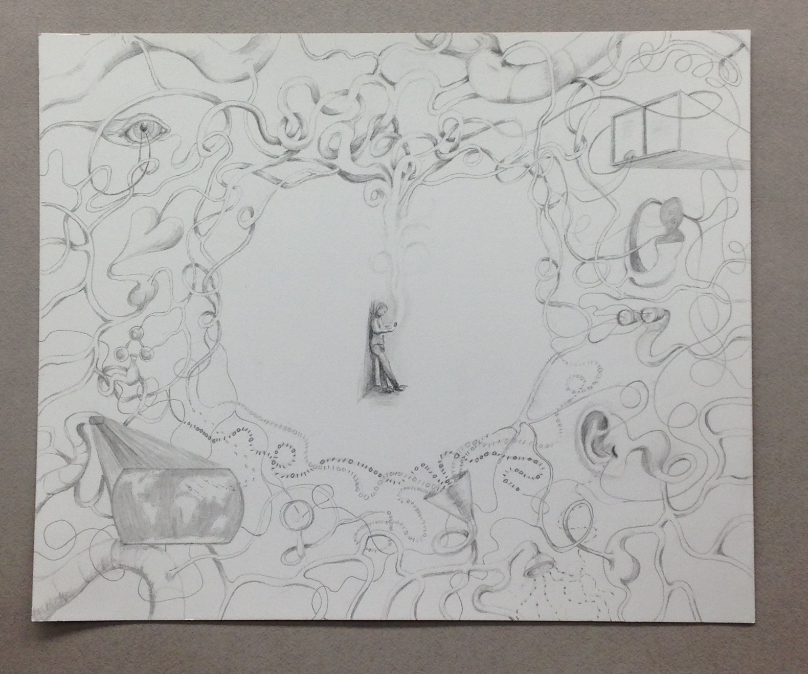
For the last six weeks we developed a project idea for six works relating to a concept of interest to us. I chose to explore living simultaneously in the real and virtual world, considering both intended and unintended consequences of computer technology.

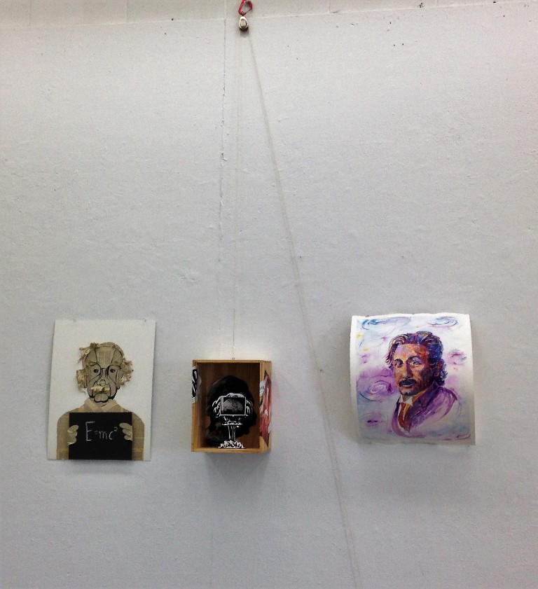
 This piece, "Adam's Creation" is a surrealistic riff on Michelangelo's "Creation of Adam" and reflects on what we have created with the development of technology and artificial intelligence. I wonder what Michelangelo would think of the world we live in?
 "Caught in the Web" is a devore piece. Devore is a silk screening technique that eats away natural fibres while leaving synthetic fibres. Stitched lines of of polyester thread held the humanoid forms in suspension once the surrounding cotton fabric was eaten away.
 One of the weeks I indulged in doodling to create "Consequences." I haven't spent this much time doodling since a data processing class in high school. The little fellow in the centre is texting on his phone.
I did a fair amount of research on technological impacts for inspiration and came across the Google books project - yikes! I essentially destroyed a book entitled "Sun and Shadow" to reflect some of the consequences of this project - apologies to Ake Edwardson, but your book's title was just too appropriate. While I came across a lot of frightening unintended consequences of technology, I am pleased to know that I am not alone in having concerns.

"Lines of communication" was another medium experiment. I embroidered and adhered thread to the canvas and am pleased with the tension it creates.


Ultimately, after 6 weeks of thinking way too much about this topic I was left with wondering "Who's driving the bus?" The answer: nobody and everybody. This is a collage and ink piece.


Overall, I really enjoyed this course and experimented with a lot of different techniques - the upside of not being tied to only traditional drawing techniques. While I like this opportunity I guess I was expecting to be required to become more proficient at more traditional drawing techniques - something I have a hard time motivating myself to do independently.


Tuesday 8 March 2016

Back to School Update: Painting 213 - Formal and Conceptual Issues

This was my first second-year painting class. I was expecting that it would motivate me to spend more time with a brush in hand - there was some of that if we chose, but again the focus tended to be on concepts and contemporary art practices. We also did presentations on contemporary artists which I found helpful - I was shocked to see very few artists on any of the lists who actually use a brush and paint. I chose to present on Neo Rauch, an East German artist who has seemed to progress in the opposite trajectory of minimalism - an encouraging trend to my mind.
Our first assignment focussed on portraiture in contemporary art and required three portraits of an individual of our choice. Coincidentally, I had picked up a commemorative Scientific American issue on Albert Einstein a few weeks before. I've been interested in him as a enigmatic human being for a long time: a perfect subject for exploring portraiture. The piece on the left was a collaged caricature (using an old paperback biography that I was miraculously able to find in my storeroom). The middle piece was a take on his thought experiment elevator.

 The final piece was an impressionistic portrait on curved paper, intended to reference the implications his theories have had on our understanding of space.


 The next assignment was a collaboration with another student and required an interactive component. My young partner and I came to the realization that we both loved experiencing the outdoors and chose to do an installation which was an homage to the natural environment. I set up a plein air painting station (with pond water for water colour painting). There was a central top-lit hanging of squirrel-assisted art work. I have an area on our property where I hang art pieces and document their change - the squirrels are fascinated by it and contribute their changes - they must have the prettiest nests, but I have yet to find one. Mount St Piran is a fabulous hike to go on if you ever want to experience spontaneous interactive art - there are innumerable cairns on its rounded summit. I created a cairn building opportunity at the end of the exhibit. Interestingly, someone felt the need to destroy it (with apologies) - different than I expected, but made me smile. I also brought in an end of season flower pot - one of the hardest gardening tasks for me is cutting back plants that are trying desperately to survive into the winter despite our harsh climate.
Lucy created a beautiful cup of growing grass, made paper from leaves, and created a video of a forest. There was also an audio track of natural sound effects and leaves to be raked on the floor. Installation is generally not my favorite thing, but this worked well as a group project and the atmosphere was lovely if I do say so myself.


The third assignment was "colour: creating a mind-scape" and we were asked to look at different contemporary artists for inspiration. Damien Hirst's spot paintings got me thinking about how to create a colour "sampler" -  a study of colour that would give me the opportunity to experiment with combining warm and cool versions of the three primary colours. I also wanted to experiment with stretching canvas on plywood. In another life a lot of my work involved statistics, probability, and sampling - it was fun to flip back into that jargon and create a plan that I had to follow that involved a random selection of colour pairs and location on a 6X6 grid. It was  a very liberating experience that I think I may revisit in the future - it was wonderful to be able to play with the colours and not worry about the final product. The biggest challenge was sticking with the rules when the randomness forced me to do something that I didn't want to do.


The final assignment involved using materials of our choice to depict "place". I was bound and determined to actually paint a landscape. We had a list of contemporary artists to choose from for inspiration - once again I was disappointed to find not a single inspiring landscape artist on the list. My instructor later pointed me towards David Schnell who was very inspiring, but by that point I had my mind set on trying to portray this feeling of the "place" of landscape painting being broken in contemporary art. The idea was to paint a landscape breaking apart and the bits being carried away by ravens (in the little picture, a tiny bird is carrying away a fragment) - all in the presence of an absent observer.
In the end, I learned a lot from the course in how contemporary artists are depicting things like place, portraiture and colour etc. I did learn a few techniques which came from the choices I made - e.g. experimenting with colour, stretching canvas, and layering multiple spatial planes on a 2 dimensional surface - all I plan to do more of.

Friday 4 March 2016

Back to School Update: Drawing 221 - Ideas and Concepts

This drawing course that I finished last Fall focused on the idea-based nature of studio practice. There were four major assignments around concepts or approaches prevalent in contemporary art practice. The assignments illustrate my point in an earlier post about the drawing classes' emphasis on concepts and ideas and less on technique. None-the-less it was a very valuable exercise on a number of levels. There was a lot of emphasis on looking at contemporary artists' work for inspiration as well as on the planning and documentation processes associated with creating an art work and creating an artist's statement which I found particularly helpful.
A Night at the Cosy Pub: Spike, Carmen Miranda, and Smurfly Seuss Druid

The first assignment focused on repetition and revision. The idea behind my project was a contemporary play on the concept of a tea cosy and the social gatherings that occur around a pot of tea.

Fundamentally I am very interested in why we attribute an inner life to inanimate objects and what characteristics of objects contribute to this. I also became interested in how repetition and placement impacted the narrative. These questions are under discussion in this cosy pub scene .. or is it just a fun night out?


How to Achieve Balance
The second project project had us creating a piece based on a binary notion of our choosing. It often feels that it is inherently part of human nature to operate in either of two extreme modes: complacency or panic and I thought this would be an interesting concept to explore. This was one of those pieces that felt good in concept and everything was mapped out and well planned and then  ... it turned into something completely different than I expected - in this case not a happy accident. Everything was going well in pencil but it needed some intensity so I tried wet brushing on powdered graphite and it just went downhill from there - made a nice fire starter though.

The third assignment involved creating a thematic or metaphorical piece. Part of the assignment was to examine the relationship between concept and media. I started thinking about wool and associated meanings - loss and the Bo-peep nursery rhyme came to mind. I've been wanting to experiment with felting wool onto chicken wire for a while and this seemed like an ideal opportunity. Despite some extensive researching I could not find any one who has tried this so was on my own with lots of experimentation to figure out how to make it work. The piece was bottom lit with a flickering internal chest light which is not evident here. Felting on chicken wire is not for the faint of heart but I think it created an appropriate metaphor for the concept of loss and all its associated emotions.The rigidity of the wire and shrinking of the felt created this feeling of ephemeral tension and conflict in an ethereal object.


The final project required the creation of body prosthetics and incorporating them into a performance piece (yup - this is a drawing class). So I decided to do a humorous piece on inner speech and how we have developed a set of terms and concepts to characterize decision-making approaches. This is me listening to my gut.


Additional cast members include Conscience, Temptation,  my heart, my gut, and of course I had to make a comment on too much navel gazing.


Probably one of the most helpful things associated with this class, besides the procedural things I mentioned before, was the requirement to map out the influence of the contemporary art world, the real world and our own personal experience for each of our projects. I think I came away from this class with a much better ability to research, plan and document my work as well as to look at it within a broader context.


Friday 26 February 2016

Back to School Update - Fibre 211: Printing on Fabric

This Printing on Fabric class was amazing. I knew little about the process before I began and learned so much. I am not sure how much more silk screening on fabric I will do, but many of the specifics such as dyeing, repeated patterns, and general design will transfer well. As I started working on designs, I came to realize how little I knew. It was also one of the most demanding classes I have taken. All I can say is thank goodness for the industrial revolution. 
The first assignment was to make a series of pillows using paper and photo stencils and pigment. The idea was to create a series of unique but coherent pillows. My original idea was to work with stencils of landscape objects and progress from a more representational scene to abstract. As you can see that idea evolved as I made mistakes and my instructor encouraged me to experiment with overlaying pattern a lot more than I planned. A very humbling but fun experience overall. 
The second assignment introduced dyeing and discharge to create an interpretation of a location of personal significance. I chose to do some wall hangings that I intend to use as a backdrop for my quirky felt sea creatures. The idea was to represent my take on the undersea scuba diving experience - one that is marvelous, fun, and surreal but a little edgy as well. The colours were chosen to match the felt creatures and I had a lot of fun experimenting with colour and design in way that I have never done before.


 The third assignment involved repeat printing, dyeing fabric, and printing with dyes. I started working with a maple leaf pattern on one yardage and then designed a second pattern that followed the seasonal changes of maple trees (brown yardage) to achieve a more striped appearance. Making a repeat pattern is a lot of fun but a detailed one is best suited to obsessive compulsives. Getting everything to line up and be clean looking is much harder than it looks. The other challenge is that you don't really know what the colours, and especially their intensity, will look like until the fabric is steamed. The orange turned out much brighter and the brown lighter than I intended, but I like it none the less.

 The last assignment was to create two objects of our choice, based on what we had learned. I decided to make a cotton table runner reminiscent of cave art for my own contemporary cave and and silk yardage dyed and printed with natural dyes to make silk scarves. The natural dyes were lovely but a little challenging to work with. I also learned that they faded with the washing requirements of the felting process so the final product was fainter than I expected, but still lovely to my mind.